Availability Metrics Explained and How to Measure Uptime


A team opens the morning dashboard and sees 99.9% uptime for the month. The graph looks calm. Then support tickets start piling up. Customers couldn't log in during a dependency failure, checkout timed out from one region, and a brief DNS issue slipped between checks. The percentage looks respectable, but the user experience was awful.
That gap is why availability metrics matter.

A raw uptime number answers only part of the question. It can tell a team whether a service was reachable for most of a reporting window. It doesn't automatically tell them whether users could complete real work, whether alerting was trustworthy, or whether the chosen target leaves enough room for maintenance, incidents, and safe releases. That is where availability metrics become more useful than a vanity percentage.
Teams that run SaaS platforms, internal tools, APIs, client environments, or a single production app all run into the same confusion. They need to define what "available" means, measure it in a way that matches reality, and report it without hiding uncomfortable details. A basic website uptime guide helps with the foundation, but operations usually get harder once percentages meet paging, contracts, and customer expectations.
A service can be "up" on an infrastructure dashboard and still be unavailable to the people trying to use it.
Good availability work turns broad promises into operating rules. It helps a team decide how often to check a service, when to confirm failures from multiple regions, which incidents count against a target, and when an error budget is getting too thin to keep shipping risky changes.
Table of Contents
- Introduction Why Availability Metrics Matter More Than Uptime Alone
- Understanding Availability Percentages and the Nines Model
- How SLA SLI and SLO Work Together
- Key Reliability Metrics That Explain Downtime
- How to Measure Availability Without Fooling Yourself
- Using Error Budgets Status Pages and Automation to Act on Metrics
- Putting Availability Metrics Into Practice
Introduction Why Availability Metrics Matter More Than Uptime Alone
Availability metrics are often treated like a report card. That framing is too small.
A better framing is a budget. Every target gives a team a limited amount of failure it can spend across outages, degraded releases, maintenance choices, and detection delays. Once reliability is viewed that way, the conversation changes. Instead of asking only, "What percentage did the service hit?" teams start asking, "What kind of operating behavior does this target allow?"
Where teams usually get misled
A dashboard can still lie without showing false data. It lies by omission.
Common examples include:
- Single-point checks: One probe location fails because of a local network issue, but the alert looks like a global outage.
- Sparse cadence: Checks run infrequently enough that short incidents disappear from the monthly summary.
- Weak success tests: A homepage returns a success code while sign-in, API calls, or payment flows are broken.
- Contract-only reporting: An SLA excludes planned maintenance, but customers still experienced downtime.
These aren't edge cases. They're normal failure modes in availability programs that never moved beyond "is the host responding?"
What availability metrics should help a team do
Useful availability metrics support decisions in at least four areas:
| Decision area | What the metric should answer |
|---|---|
| Target setting | Is the service aiming for a baseline target or a stricter one? |
| Measurement | What counts as available, and from whose point of view? |
| Operations | When should the system page, escalate, or suppress noise? |
| Reporting | What should customers, leaders, and engineers see after an incident? |
That practical angle matters more than textbook definitions. A junior engineer doesn't need a pile of acronyms first. They need a way to judge whether the monitoring setup matches user reality.
Understanding Availability Percentages and the Nines Model
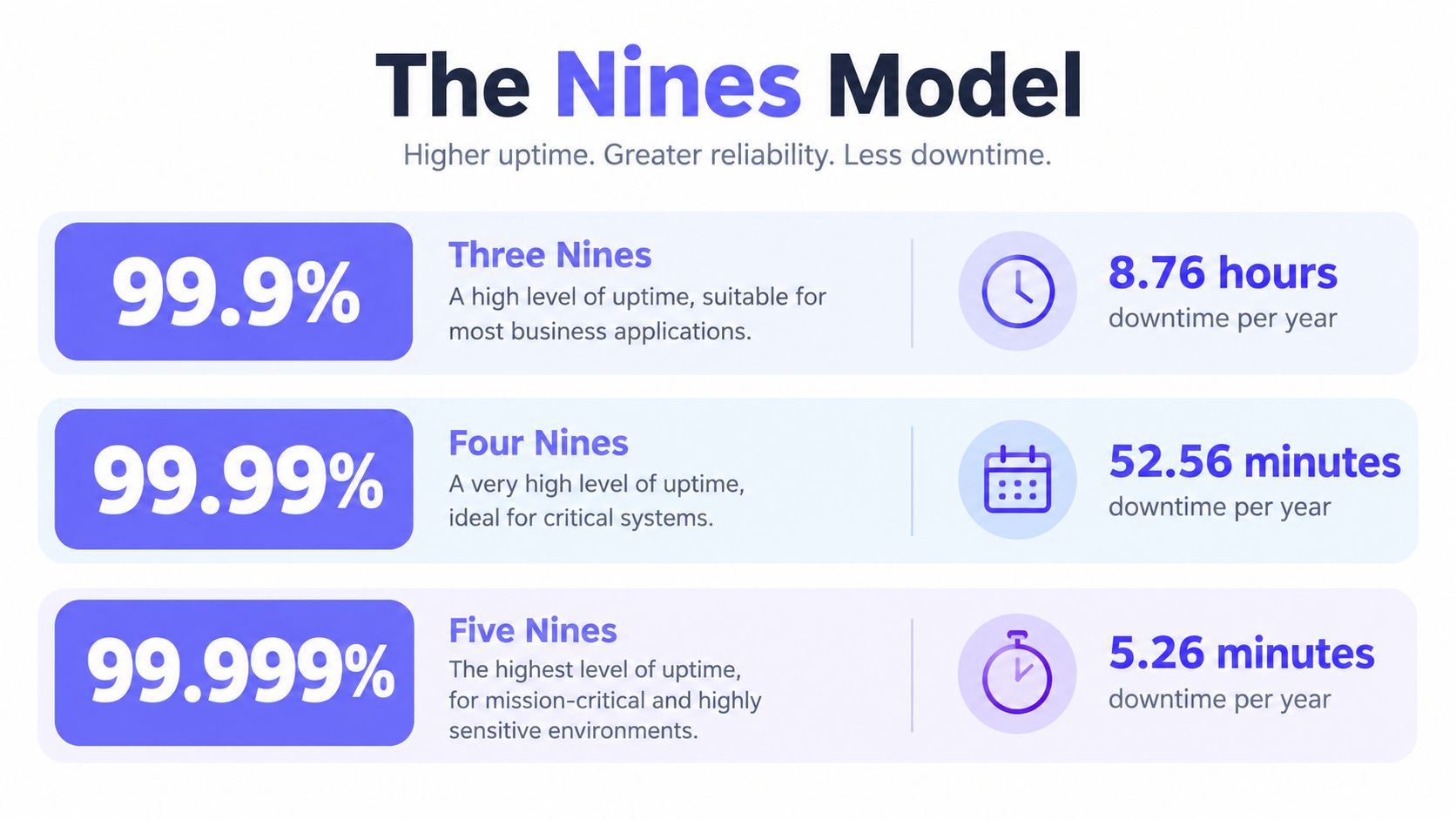
Availability is usually expressed as the percentage of time a service is usable. The industry compresses those percentages into the shorthand of nines because it makes reliability targets easier to discuss and compare.
Why percentages feel harmless until they become downtime budgets
A percentage sounds abstract. A downtime allowance feels real.
Google's SRE guidance shows that 99.99% availability allows only 52.6 minutes per year, 12.96 minutes per quarter, 4.32 minutes per month, 60.5 seconds per week, and 8.64 seconds per day. 99.999% cuts that to 5.26 minutes per year and 25.9 seconds per month, as shown in Google's availability table for SRE planning.
That translation is why teams talk in nines. It turns "high availability" into something operational.
Three nines versus four nines
The most common public benchmark is 99.9% uptime, often called three nines. That corresponds to about 8.76 hours of downtime per year and roughly 43.8 minutes per month. By contrast, 99.99% uptime, or four nines, permits only about 52.6 minutes per year, according to the Uptime Institute's discussion of 99.9% versus 99.99% expectations.
That is the part many newer operators underestimate. One extra nine doesn't mean a small improvement. It shrinks the failure budget by about an order of magnitude.
Practical rule: Every extra nine sounds like a marketing upgrade. In operations, it behaves like a much stricter spending limit.
A simple analogy helps. Think of a reliability target as a yearly travel budget.
- With three nines, a team has enough "spend" to survive a few meaningful mistakes, slower restores, or longer maintenance windows.
- With four nines, the same habits become expensive very quickly.
- With five nines, even short detection delays and false positives start to matter because the margin is tiny.
Why the nines model became standard
The nines model became important because distributed systems made vague language useless. Teams needed a way to talk about service-level reliability, not just whether an individual server was still running. "Highly available" means almost nothing by itself. A target in nines can be planned against, monitored, and tested.
For day-to-day work, that means the number isn't just for leadership slides. It shapes design choices such as failover behavior, deployment safety, and the amount of alert noise a team can afford.
A tool like the SLA uptime calculator from Fivenines is helpful because it converts a headline percentage into actual downtime allowances a team can reason about before they promise too much.
How SLA SLI and SLO Work Together
Three terms confuse almost everyone at first: SLI, SLO, and SLA. They sound similar, but they play different roles.
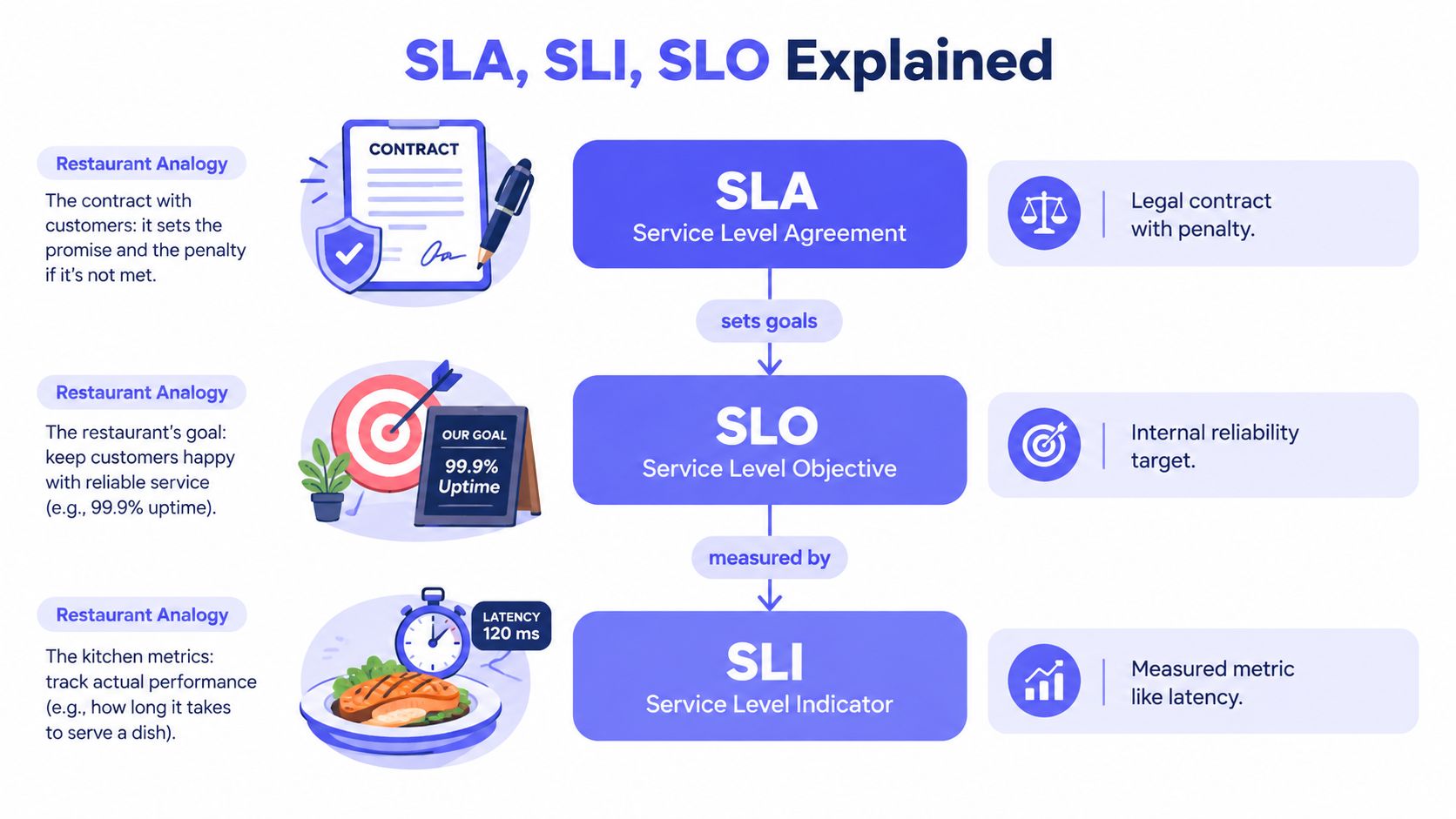
A simple way to think about them is a restaurant.
- The SLI is the measurement. How long did orders take? How many arrived correctly?
- The SLO is the internal target. The kitchen aims to get orders out within a chosen standard.
- The SLA is the external promise. If the restaurant breaks a contractual catering commitment, there may be consequences.
The hierarchy in plain language
| Term | What it is | Who cares most |
|---|---|---|
| SLI | The measured indicator of service behavior | Engineers and operators |
| SLO | The target set for that indicator | Engineering, product, operations |
| SLA | The customer-facing agreement tied to commitments | Customers, legal, account teams |
Keep this distinction close: An SLI measures reality, an SLO sets the goal, and an SLA defines the promise.
Teams get into trouble when they swap these roles. If a team pages directly on the customer contract, alerts often become noisy and late. If a team reports only internal objectives to customers, expectations drift.
A practical example helps. A login service might track successful authentication requests as an SLI. The engineering team sets an SLO around that indicator. The sales contract, meanwhile, might express availability at the broader service level and specify exclusions or remedies. Each layer exists for a different reason.
For a deeper operational view of that contract layer, service level agreement monitoring is where reporting rules, exclusions, and accountability become concrete.
A short visual explanation can also help anchor the terms before they become policy discussions.
Why this matters for alerting
An engineer usually owns the SLI instrumentation. A reliability or platform group often shapes the SLO. A business or service owner may negotiate the SLA. When those owners don't line up, alert fatigue follows.
Good alerting usually tracks the internal objective first, because that gives the team time to react before contractual pain arrives. That also keeps the engineering loop focused on user impact instead of a legal document.
Key Reliability Metrics That Explain Downtime
Availability percentage tells a team how much unavailability happened. Reliability metrics help explain why the number ended up there.
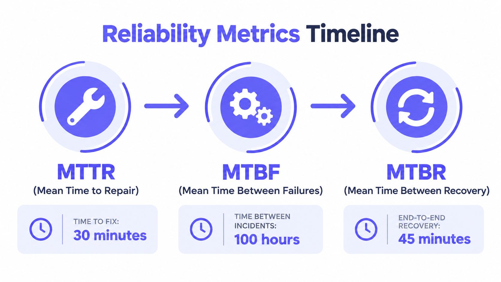
Reading downtime as a timeline
A service runs. It fails. Someone detects it. The team restores it. Then the service runs again.
That timeline is where terms like MTTR, MTBF, and MTTF become useful:
- MTTR usually means mean time to repair or restore. It focuses on how long recovery takes once something breaks.
- MTBF means mean time between failures. It is used for repairable systems and helps show how often incidents happen.
- MTTF means mean time to failure. It is more useful for non-repairable components or situations where the item is treated as consumed rather than restored.
Which metric answers which question
A junior engineer often asks which one matters most. The answer depends on the problem.
| Metric | Best question to ask |
|---|---|
| MTTR | How quickly does the team recover? |
| MTBF | How often does the service break? |
| MTTF | How long does a non-repairable component last before failure? |
If a service is stable but recovery is slow, the work is different than a service that recovers quickly but fails often. One needs better incident response. The other likely needs design, testing, or change-management work.
Low availability can come from frequent failures, slow recovery, or both. The percentage alone won't tell which one needs fixing.
How these metrics connect to availability
In planning discussions, teams often combine failure frequency and repair time to estimate inherent availability. The common model uses MTBF / (MTBF + MTTR). Even without plugging in numbers, the intuition is simple: longer healthy periods help, and shorter repairs help.
That relationship matters because it pushes improvement work in two directions:
- Reduce failure frequency through safer deploys, stronger dependency handling, and fewer single points of failure.
- Reduce restoration time through clearer alerts, better runbooks, automation, and cleaner escalation paths.
When the environment includes disposable infrastructure, hardware lifecycles, or components that aren't repaired in place, the framing shifts again. That is where mean time to failure becomes the more useful lens than MTBF.
How to Measure Availability Without Fooling Yourself
An alert fires at 2:07 a.m. Your dashboard says the service is down. Customers in one region are complaining, but users somewhere else are still working normally. By morning, the report says availability stayed above target. Everyone has numbers, yet nobody trusts them.
That problem usually starts in the measurement design.
A team can do the math correctly and still reach the wrong conclusion because it measured the wrong thing, from the wrong place, or too slowly. Availability is not just a percentage you collect. It is a policy choice about what counts, what gets ignored, and how much uncertainty you are willing to accept.
Start by defining what "up" means
Treat this like writing the rules for a budget. If the rules are vague, the total will mislead you.
For one service, "up" may mean an HTTPS request returns the expected page. For another, that definition is too weak. A homepage can load while login is broken. An API can accept TCP connections while the write path fails. DNS can resolve correctly while the application behind it is unusable.
The easy signal is often the least useful one.
A good availability metric starts with the user action you care about. If customers pay you to process logins, searches, or orders, your measurement should reflect those paths instead of stopping at "port open" or "server reachable."
Probe type changes the story
Each probe answers a different operational question.
- HTTPS checks ask whether the application responds in a way that resembles a user request.
- TCP checks ask whether a port is reachable.
- ICMP checks ask whether a host can be reached on the network.
- DNS checks ask whether name resolution works.
Those answers are related, but they are not interchangeable. Using only ICMP to report application availability is like checking whether a store's front door exists and calling the business open. You need the right test for the promise you are making.
Check cadence changes the budget
Sampling frequency is part of the metric, not just a monitoring setting.
If you check once a minute, a brief outage can slip between samples and never appear in the report. If you check every few seconds, you catch more short failures, but you also need confirmation logic so one flaky response does not create noise. The stricter the target, the less room you have for blind spots.
Availability becomes a decision tool. A team chasing a very tight objective is working with a small failure budget. A loose check cadence spends that budget carelessly because the measurement misses some of the service's real behavior. The reported number may look calm while users are seeing turbulence.
One region cannot speak for every user
Customer-facing systems need more than one viewpoint.
A transit issue, resolver problem, or regional provider outage can make a healthy service look broken from one location. The reverse can happen too. One green probe in one city does not mean your users elsewhere are fine.
A better pattern looks like this:
- Run checks from multiple regions.
- Confirm a failure from more than one vantage point before paging for a broad outage.
- Record which regions saw the problem.
- Use that pattern to guide escalation and customer communication.
That approach improves more than accuracy. It helps the on-call engineer separate application failure from path failure and probe failure. Fewer false alarms also means alerts keep their credibility.
Multi-region confirmation turns availability reporting into diagnosis. It shows whether you are spending error budget on the service itself or on the path users take to reach it.
Planned maintenance needs two ledgers
Teams often mix contractual reporting with operational truth, and that creates confusion fast.
An SLA may exclude approved maintenance windows from the formal calculation. Customers still experienced unavailability during that time. Keeping only the contractual view can make the report look better than the service felt.
Mature teams usually track both:
- Contractual availability for SLA calculations
- Customer-observed availability for reliability decisions
That split is practical. One ledger supports legal or commercial commitments. The other supports engineering judgment.
Synthetic checks still need backup
Synthetic monitoring is useful, but it is never the whole picture.
A single login test does not represent every user role, dependency, or edge case. A homepage check says little about checkout, file upload, search, or background processing. Good synthetic monitoring covers a few critical user journeys clearly and honestly, rather than pretending to represent the entire product.
The most trustworthy setups combine simple reachability checks, service-aware probes, internal telemetry, and region-based confirmation. Then the availability number works less like a vanity score and more like an operating budget your team can use with confidence.
Using Error Budgets Status Pages and Automation to Act on Metrics
At 2:13 a.m., the dashboard shows 99.95% availability for the month. That sounds healthy until you notice the team has already spent nearly all of its allowed failure time. One more bad deploy, one DNS issue, or one slow recovery, and the month changes from "on target" to "we missed the objective."
That is why an availability metric needs an operating model around it. A percentage tells you where you landed. An error budget tells you how much room you have left to make changes safely.
An error budget is the gap between perfect service and your objective. If your SLO allows a small amount of failure, that allowance becomes a budget the team can spend or protect. As noted earlier, each additional nine shrinks that allowance fast. The practical lesson is clear. 99.9% and 99.99% are not just different report values. They support very different release habits, alerting thresholds, and recovery expectations.
Error budgets turn reliability into a planning constraint
Teams often struggle when product pressure and reliability pressure pull in opposite directions. An error budget gives both sides a shared unit for the discussion.
If the service is well within budget, the team may choose to keep shipping at the current pace. If budget burn spikes after a release, rollback decisions become easier because the cost is visible. If the budget is nearly gone, it often makes sense to slow risky changes, fix recurring failure modes, and protect the remaining budget the way you would protect the last portion of a cloud spend allocation near the end of the month.
That shift matters. Availability stops being a scoreboard you review after the damage is done. It becomes a tool for deciding what to do today.
Status pages should mirror operational reality
A status page is part of the service, just like alerting and incident response. Customers use it to answer a basic question: "Is the problem on your side, and what are you doing about it?"
Clear status communication usually includes a few habits:
- State the current condition plainly: active outage, degraded performance, or recovered
- Show scope: one component, one region, or a broader platform issue
- Update the incident lifecycle: investigating, identified, mitigating, monitoring
- Use the same service definitions your team uses internally: otherwise the public view and the pager view drift apart
Consistency matters more than drama. A short, accurate update builds more trust than a polished message posted too late.
Automation decides whether the metric changes behavior
Availability data has to trigger action, or it remains a monthly report.
Good automation starts with small decisions that remove guesswork. A monitor fails once. Should it page immediately, wait for a second check, or confirm from another region first? Those choices determine whether the team spends its error budget on real customer pain or on noisy alerts and unnecessary interventions.
Useful patterns include:
- Short confirmation delays: enough to filter brief blips without hiding real incidents
- Secondary checks from other regions: enough to tell the difference between local path failure and wider service trouble
- Routing by service, environment, or tenant: enough to get the alert to the responder who can act
- Escalation rules for missed acknowledgments: enough to keep incidents from stalling
- Automatic notifications to team channels: Slack, Microsoft Teams, Telegram, email, SMS, Discord, or webhooks, depending on how the team works
One practical option in this category is Fivenines, which supports multi-region uptime checks, failure confirmation before paging, white-label status pages, workflow automation, a REST API, and a Terraform provider. For teams that manage infrastructure as code, that means the monitoring policy can be versioned alongside the service instead of rebuilt by hand after every change.
The useful perspective is simple. Availability metrics are not only measurements. They are budgets and control signals. Once error budgets, status communication, and automation all use the same rules, the number starts guiding release decisions, incident response, and customer communication in a way a raw uptime percentage never can.
Putting Availability Metrics Into Practice
A mature availability practice doesn't start with a huge observability program. It starts with a few disciplined choices.
First, pick a target that matches the service's real business importance. A customer-facing login flow, public API, or revenue path usually deserves a stricter objective than an internal convenience tool. The target should be ambitious enough to matter and realistic enough to operate.
Then define what "available" means in user terms. That often means moving beyond a simple host or port check and choosing signals that reflect whether people can complete the work the service exists to support.
A practical implementation checklist looks like this:
- Choose a clear objective: Set a target in nines only after converting it into a downtime budget the team can live with.
- Define the SLI carefully: Measure a meaningful service outcome, not just process reachability.
- Check from multiple regions: Confirm failures before paging so alerts are trusted.
- Use cadence intentionally: The interval should be tight enough to catch the incidents that matter.
- Track recovery behavior: MTTR and related reliability metrics help explain what the headline percentage can't.
- Separate reporting views: Keep contractual availability and customer-observed availability distinct when maintenance or exclusions apply.
- Wire metrics to action: Use error budgets, escalation workflows, and status pages so the numbers change operational decisions.
The strongest availability metrics don't just make monthly reports cleaner. They make production behavior more predictable.
When a team audits its current setup with that standard, weak spots usually become obvious. The probes may be too shallow, the cadence too loose, the targets too vague, or the reporting too flattering. Fixing those gaps is what turns availability from a dashboard number into an operating discipline.
Fivenines gives teams a practical way to apply the ideas in this guide with multi-region uptime checks, failure confirmation before paging, status pages, and automation that routes incidents through the channels they already use. For DevOps teams, MSPs, and solo operators who want availability metrics tied to real operational workflows, Fivenines is worth a look.