Monitoring Strategy: The Practical Guide for Modern Teams

At 3 a.m., the incident channel fills up fast. The dashboard is green. Alertmanager stayed quiet. Customers are already reporting failures. Someone starts opening random Grafana boards, someone else tails logs, and the team burns the first half hour proving that the monitoring setup can't answer the one question that matters: is the service healthy for users right now?
That's the normal failure mode of a bad monitoring setup. Not because Prometheus is broken, or Grafana is weak, or the team forgot one magic panel. It fails because nobody designed a real monitoring strategy. They collected signals. They didn't define decisions, ownership, and response.
That distinction matters more now because monitoring has become a core operational discipline, not a side task. One market estimate places the IT infrastructure monitoring market at US$25.88 billion in 2025 and projects US$35.96 billion by 2030, with a 6.8% CAGR over 2025 to 2030 according to The Business Research Company's IT infrastructure monitoring market report. Teams aren't spending on monitoring because graphs are interesting. They're spending because outages are expensive, distributed systems are harder to reason about, and uptime is now a product feature.
A good monitoring strategy starts with subtraction. It asks what to keep, what to cut, what to page on, and who owns each signal when it turns red.
Table of Contents
- Why Most Monitoring Setups Fail Before They Start
- The Core Concepts Every Strategy Stands On
- Choosing Metrics and Checks That Match Your Stack
- Stop Monitoring More, Start Monitoring Better
- Alerting, Escalation, and Runbooks That Actually Page
- Migrating From Prometheus, Grafana, and Alertmanager
- Validation, Iteration, and Your First 30 Days
Why Most Monitoring Setups Fail Before They Start
The first failure happens before a single exporter gets deployed. Teams design around tools instead of services. They ask, “What can Prometheus scrape?” instead of “What would prove checkout works, login works, or job processing works?”
That tool-first habit creates a brittle setup. It produces lots of data and very little operational clarity.
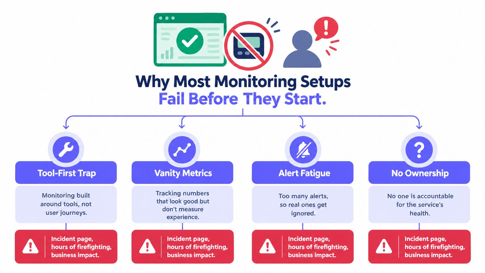
The four failure patterns
Most broken monitoring environments collapse in the same four ways:
- Tool-first design: The stack reflects what exporters expose, not what users depend on.
- Symptom alerts with no owner: A queue depth alert fires, but nobody knows which team is supposed to act on it.
- Vanity dashboards: Boards fill up with CPU, memory, request counts, and colorful lines that look useful during planning and get ignored during incidents.
- No shared health definition: Engineering, support, and leadership all use different standards for “up.”
The result is predictable. The system can report activity, but it can't support judgment.
This is a planning problem
A monitoring strategy is the discipline of deciding what to watch, why it matters, and who responds before the next outage forces the conversation. That means every page, dashboard, and retained metric needs a reason to exist.
Practical rule: If a signal can't trigger a decision, it shouldn't be in the paging path.
This is also why “more observability” doesn't automatically fix anything. In a large industry survey, only 10% of organizations reported having full observability in 2024, while 36% had partially started and 20% planned to start. The same survey found that 82% said their production incident MTTR was over an hour in 2024, up from 74% in 2023, 64% in 2022, and 47% in 2021 according to the Observability Pulse 2024 survey from Logz.io. Teams are collecting more signals, but many still aren't shortening incidents.
That's the warning. Monitoring maturity isn't measured by telemetry volume. It's measured by whether responders can detect, understand, and act quickly when production is on fire.
The Core Concepts Every Strategy Stands On
A lot of teams still treat SLI, SLO, and SLA like certification vocabulary. That's a mistake. They're just a chain of promises.
An SLI is the measurement. An SLO is the target. An SLA is the consequence if the target is missed.
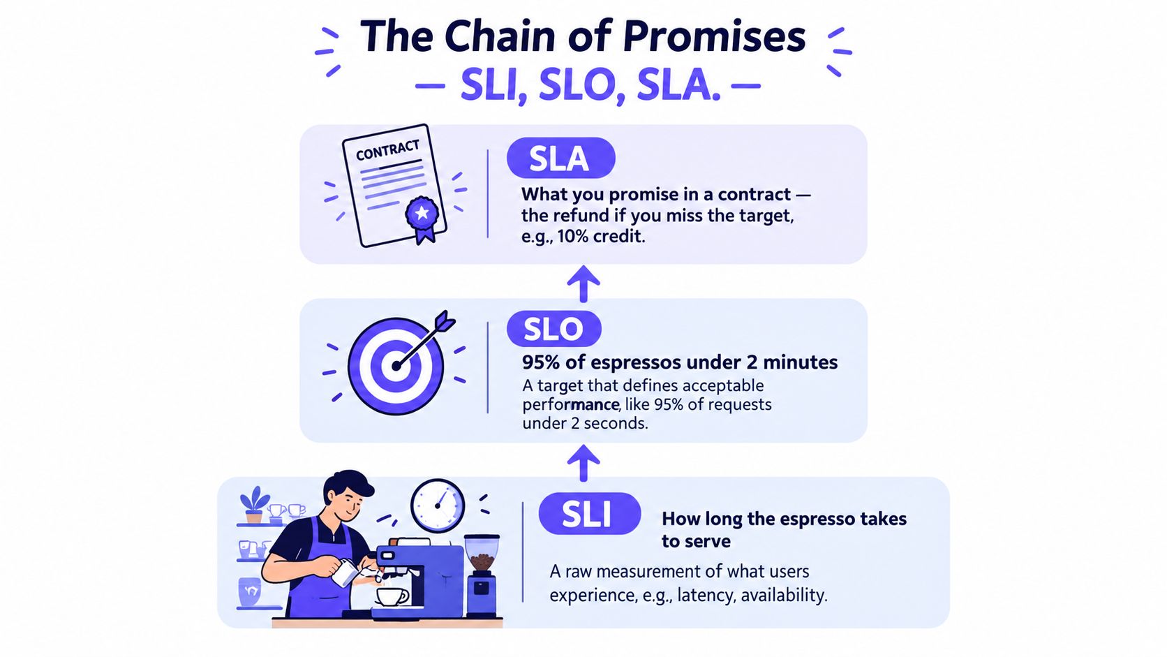
Think in promises, not acronyms
The café analogy works because it's simple.
- SLI: how long the espresso takes to serve
- SLO: most espressos should arrive within the target time
- SLA: what the café owes if it keeps missing that promise
For production systems, the same logic applies. Latency, availability, successful job completion, and request success are raw measurements. The target defines acceptable service. The contract, whether external or internal, defines the cost of failure.
Teams that need a sharper framework for uptime indicators should review availability metrics and what they actually measure.
Metrics, logs, and traces are not competing stacks
The three observability pillars are just different lenses on the same user path.
- Metrics answer whether behavior changed.
- Logs show what happened at specific points in time.
- Traces show where time or failure moved through a request path.
A mature monitoring strategy doesn't argue about which pillar matters most. It uses each one for its proper job. Metrics page. Logs explain. Traces localize.
Metrics should wake people up. Logs and traces should help them stop being awake.
The support terms that actually matter
A working strategy also needs a few supporting concepts defined up front:
- Error budget: the amount of failure the service can absorb before reliability work overrides feature work.
- Burn rate: how quickly that error budget is being consumed.
- Coverage: whether critical services, dependencies, and user journeys emit the telemetry needed for detection.
- Ownership boundaries: which team owns the signal, the service, and the first response.
Coverage matters more than many teams admit. A Microsoft empirical study found that about 17% of incidents either lacked monitors or had missing telemetry coverage, and those gaps delayed detection because automated watchdogs couldn't fire when telemetry, thresholds, or granularity were wrong according to Microsoft Research's incident detection study.
That finding should change how teams plan. A beautifully labeled dashboard is worthless if the actual failure mode isn't instrumented.
The rule that keeps the whole system honest is simple: every metric in the strategy must map back to a user-visible behavior. If it doesn't protect user experience, capacity, correctness, or recovery, it doesn't belong.
Choosing Metrics and Checks That Match Your Stack
Many teams pick metrics that are easy to graph. That's lazy, and it leads to false confidence. CPU charts are easy. User impact is harder. The harder one is the right one.
The right monitoring strategy starts by asking which failure a user notices first, then choosing checks that expose that failure before support does.
Pick by failure domain
A production stack usually needs coverage across service availability, compute, network paths, container runtime behavior, and accelerator workloads when GPUs are involved. The mistake is treating these like separate observability programs. They aren't. They're parts of one service health model.
| Domain | Metrics That Matter | User Impact Protected |
|---|---|---|
| Uptime | Synthetic HTTP or HTTPS checks, TCP reachability, DNS resolution, real-user success signals | Whether users can actually reach the service |
| Server | Saturation, load, memory pressure, disk contention, error rates | Slow requests, failed jobs, degraded node performance |
| Network | Packet loss, retransmits, DNS latency, dependency path failures | Timeouts, intermittent failures, regional access issues |
| Container | Restart count, cgroup pressure, image pull latency, workload health | Crash loops, startup delays, noisy-neighbor resource pressure |
| GPU | Utilization, memory headroom, queue depth | Delayed inference, idle expensive hardware, stalled batch processing |
A team building baselines before setting thresholds should start with performance baseline guidance for stable alert thresholds.
What to monitor in each layer
For uptime, ping alone doesn't prove the product works. A host can answer ICMP while login is dead, checkout is timing out, or a certificate issue blocks real traffic. Synthetic checks should hit real user paths, and real-user signals should confirm what synthetic probes can miss.
For servers, CPU percentage is one of the most abused metrics in operations. Saturation and error behavior matter more. A machine can sit at moderate CPU while requests queue, disks thrash, and memory pressure causes ugly latency.
For networks, teams should stop treating the network as a black box between application nodes. Packet loss, retransmits, and DNS resolution tied to request paths are more useful than generic interface graphs no one checks during an outage.
Containers and GPUs need different thinking
Container environments produce huge telemetry volume, much of it useless. Generic pod status isn't enough. Restart counts, scheduling delays, cgroup pressure, and image pull latency expose what operators can fix.
GPU fleets fail in a different way. The expensive problem is often not overload but underuse. If queue depth climbs while utilization stays low, or memory headroom collapses while throughput doesn't rise, the team has a scheduling or workload shape issue, not a simple capacity issue.
The filter for every metric is blunt and should stay blunt:
- Tie it to an SLI: If the metric doesn't support an availability, latency, correctness, or completion signal, cut it.
- Assign an owner: If nobody owns the service, the alert becomes background noise.
- Require a decision: If the metric turns red and nobody knows what action follows, it belongs in exploratory telemetry, not operational monitoring.
That's how a stack stays useful instead of decorative.
Stop Monitoring More, Start Monitoring Better
The monitoring industry keeps selling expansion. More telemetry. More pipelines. More agents. More retention. That sounds mature until someone asks what the team uses.
One 2025 observability report found that only 13% of collected telemetry is actively used for monitoring, alerting, or troubleshooting according to the Sawmills 2025 observability report. That's not a tooling failure. That's a governance failure.
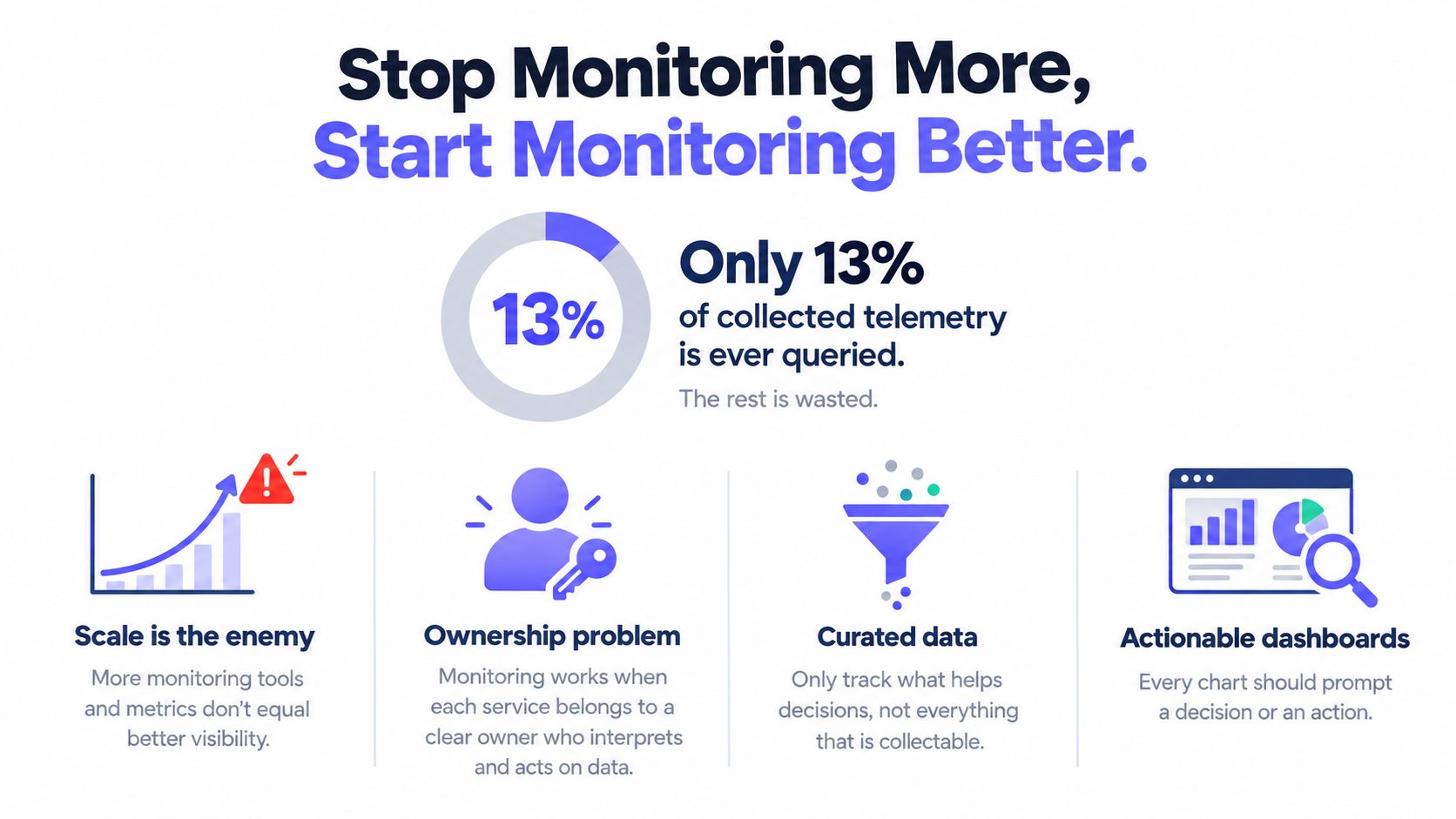
Run a subtraction audit
Teams redesign monitoring the wrong way when they add before they cut. The first pass should be destructive.
Start with these questions:
- Which dashboards did nobody open last quarter
- Which alerts never fired, or fired so often they trained responders to ignore them
- Which metrics can no on-call engineer explain without digging through exporter docs
- Which high-cardinality series exist only because a collector made them available
- Which checks duplicate better evidence elsewhere
This audit usually reveals a simple truth. The biggest source of noise isn't missing data. It's stale, ownerless, duplicated data.
The goal isn't maximal visibility. The goal is fast, credible decisions under pressure.
Three rules that force discipline
A serious monitoring strategy needs hard rules, not suggestions.
- Every metric needs a named owner. If a service team can't defend why the metric exists, retention should expire it.
- Every alert needs a documented action. If the responder can't do something specific, it isn't a page.
- Every dashboard must justify its cost. Retention, storage, and query load aren't free just because they're hidden inside a platform invoice.
Those rules are how teams stop confusing collection with observability.
What to cut first
The first cuts are usually obvious once ownership is enforced:
- Drop raw container noise: Keep workload-level health and resource pressure. Cut endless low-value per-container series that nobody uses in triage.
- Remove duplicate synthetic checks: If a synthetic monitor only confirms what stronger real-user evidence already proves, it's clutter.
- Kill vanity whitebox metrics: If a metric exists only because an exporter shipped it and nobody uses it to protect user experience, retire it.
- Collapse duplicate dashboards: Ten near-identical service boards are organizational debt, not visibility.
Leadership sometimes hears this as a reduction in coverage. It isn't. It's a shift from passive collection to accountable signals. The team isn't watching less. The team is choosing what deserves operational trust.
Alerting, Escalation, and Runbooks That Actually Page
Most alerting systems are notification engines pretending to be incident systems. They spray messages, create channel noise, and teach responders that red doesn't always matter.
A page should mean one thing: a human needs to act now because service experience is at risk.
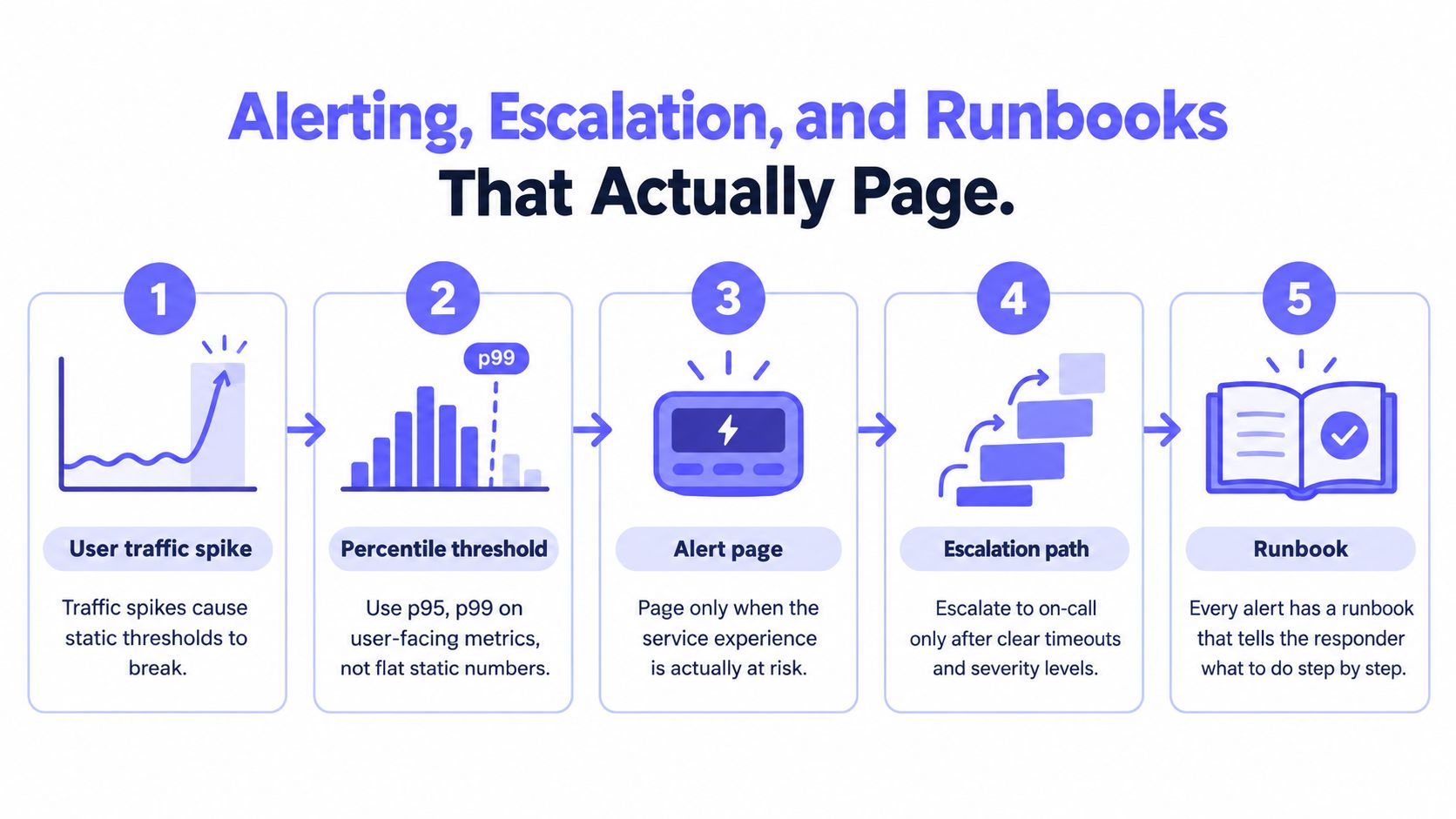
Page on symptoms users feel
Static thresholds break under bursty traffic, release windows, and normal daily cycles. Research on distributed systems recommends percentile-based latency thresholds such as p95 and p99 rather than averages, because tail latency exposes user-visible degradation that means often hide according to the distributed systems alerting strategies paper.
That should shape the paging layer:
- Use percentile-based latency for user-facing services
- Require sustained deviation, not a brief spike
- Correlate evidence across signals before paging
- Prefer symptom alerts over speculative cause alerts
A p99 latency breach on checkout plus an error rate that's too high is page-worthy. A single CPU spike on one node usually isn't.
Teams that need to tighten their alert design can compare these principles with practical alert setup patterns for production monitoring.
Escalation rules should be boring
Escalation policy design doesn't need creativity. It needs predictability.
A clean model looks like this:
- Primary on-call: receives the initial page and owns acknowledgment.
- Secondary responder: gets added if the alert isn't acknowledged quickly.
- Team lead or incident commander: joins if impact continues or mitigation stalls.
Rotation handoffs should follow local time zones and working reality, not arbitrary calendar neatness. If a handoff lands in the middle of someone's night because the schedule looked symmetrical on paper, the schedule is bad.
Runbooks separate professionals from tourists
Every page-worthy alert should include a runbook URL in the alert payload. Not a wiki homepage. Not a vague team folder. The exact document for that alert.
That runbook should contain:
- Exact queries to run
- Exact dashboards to open
- Known failure modes
- Immediate mitigations
- Escalation criteria
- Rollback or isolation steps
Runbook test: once a quarter, someone who didn't write the runbook should follow it during a low-risk incident or dry run and report every dead link, stale command, and missing assumption.
That test matters because stale documentation is one of the easiest ways to turn a manageable incident into a long one. Runbooks shouldn't exist to satisfy process. They should help a tired engineer make the next correct move.
Migrating From Prometheus, Grafana, and Alertmanager
A lot of teams know their current stack is too fragmented, but they still hesitate because Prometheus, Grafana, and Alertmanager are familiar. That hesitation is rational. The legacy stack still has real strengths.
It also carries a real operational tax.
The trade-off in plain terms
Prometheus plus Grafana plus Alertmanager wins on ecosystem maturity, exporter coverage, and the depth of PromQL. It also has no license cost in the narrowest sense. Teams can build almost anything with it.
The cost shows up elsewhere. Storage scaling gets awkward. Multi-tenant RBAC often needs extra plumbing. Long-term retention usually means adding more components. Alerting, dashboards, silences, routing, and runbooks live across loosely coupled services that the team has to operate.
A unified platform flips that trade.
| Dimension | Prometheus + Grafana + Alertmanager | Unified Platform |
|---|---|---|
| Setup model | Modular and flexible | Consolidated and opinionated |
| Query language | PromQL is powerful and familiar | Native query model may be simpler but less universal |
| Alerting | Separate routing and alert management layer | Alerting is built into the same system |
| Dashboards | Very flexible, but maintenance can sprawl | Faster standardization, less custom freedom |
| Retention | Often needs extra design for long-term storage | Usually included as a platform capability |
| Multi-tenant use | Possible, but often operationally messy | Typically cleaner for teams and clients |
| Operational burden | Team runs and upgrades multiple parts | Vendor or platform handles more of the stack |
| Lock-in risk | Low at the component level | Higher because workflows centralize in one product |
A team evaluating application and infrastructure visibility in one place should also review monitoring application performance across the full stack.
A practical migration path
The cleanest migration is boring and slow. That's a compliment.
Run both systems in parallel for at least one quarter. Dual-write metrics where the APIs and collectors allow it. Migrate alerts by SLO tier, not by service ownership chart. Critical user-facing alerts move first. Low-value infrastructure noise moves last or gets deleted instead of migrated.
Dashboard conversion should happen panel by panel with a written translation table from PromQL expressions to the target platform's native query model. Without that translation sheet, teams end up hand-rebuilding dashboards inconsistently and arguing about whether mismatched numbers are query bugs or retention differences.
One platform option in this category is Fivenines, which combines Linux server metrics, network device health, website uptime, cron monitoring, alert routing, and multi-region checks with failure confirmation in one system. That kind of consolidation is useful for teams that want one dashboard and one alerting plane instead of maintaining separate components.
Migration mistakes that waste months
Three mistakes show up constantly:
- Cutting over paging before dashboard validation: If the team can't inspect the new platform confidently, don't trust it to wake people up.
- Ignoring cardinality export costs: Series volume and retention behavior don't translate cleanly between systems.
- Losing resolution during retention changes: A platform may keep data longer but at a different granularity than the old stack.
A team should stay on the legacy stack if it can credibly operate three tightly related but separate systems for the next several years, and if its engineers still benefit from the flexibility more than they suffer from the maintenance overhead. It should move when on-call simplicity, retention, tenant separation, and operator time matter more than stack purity.
Validation, Iteration, and Your First 30 Days
A monitoring strategy isn't finished when dashboards load and alerts send. It's finished when the team has tested the whole response loop and trimmed what didn't survive contact with reality.
The first month should be run like an operations reset, not a tooling rollout.
Week-by-week plan
Week 1 should be an audit. Score every existing alert on three criteria: signal-to-noise, ownership, and actionability. If an alert fails two of the three, it shouldn't survive the week unchanged.
Week 2 is recalibration. Rewrite SLIs against actual user journeys. Retire redundant checks. Lock SLO targets with the people who own the product promise, not just the people who own the cluster.
Week 3 is response hardening. Dry-run a major incident using only the new runbooks, the new dashboards, and the new paging logic. If responders need tribal knowledge to finish the drill, the system isn't ready.
Week 4 should institutionalize cadence. Set a weekly alert review, a monthly error-budget review, and a quarterly strategy reset tied to product and architecture changes.
Monitoring quality decays unless someone is assigned to prune it on a calendar.
Pre-launch checklist
Before any redesign is called done, the team should be able to answer yes to all of this:
- Service owners exist for every production service.
- SLIs are written in user-visible terms.
- SLOs are approved by engineering and product stakeholders.
- Paging alerts map to user impact or error-budget risk.
- Every alert payload includes an owner and runbook link.
- Runbooks contain exact dashboards and exact first-step queries.
- Escalation tiers are documented and tested.
- Retention tiers are intentional rather than default leftovers.
- Duplicate dashboards are removed or merged.
- Unused metrics are scheduled for expiration instead of permanent retention.
- Synthetic checks have a reason to exist beyond habit.
- Cross-environment dependencies are visible enough to trace a user failure across boundaries.
- The on-call team has dry-run practice with the new setup.
- One named accountability owner governs the strategy, not just the tools.
- A recurring review cadence exists so the setup doesn't drift back into noise.
One more reality check matters here. In a 2026 survey, 77% of IT practitioners cited lack of cross-environment visibility as their primary observability hurdle, and organizations averaged seven monitoring tools according to the SolarWinds 2026 report on observability hurdles and AI. That's why validation has to include boundaries between cloud, on-prem, containers, network devices, and service checks. The hard failures usually happen between systems, not neatly inside one dashboard.
A good monitoring strategy is less about adding sensors and more about building operational trust. Teams should know what's breaking, who owns it, how they'll respond, and which signals deserve to survive.
Fivenines helps teams consolidate server metrics, uptime checks, network health, cron monitoring, and alert routing into one operational view so monitoring strategy doesn't get buried under tool sprawl. For teams redesigning an aging Prometheus, Grafana, and Alertmanager setup or tightening a leaner stack, Fivenines is worth evaluating as a practical way to reduce moving parts and make ownership easier to enforce.