Trend Analysis for Infrastructure Monitoring Explained

A server can pass every CPU threshold for months and still trigger an avoidable incident. Disk usage rises gradually, backup retention expands, logs accumulate, and the dashboard stays green because no single sample crosses an alert boundary. By the time the filesystem turns red, the on-call engineer isn't diagnosing a developing problem. They're recovering from one.
Trend analysis addresses that blind spot by examining direction over time, then connecting the signal to a forecast, an owner, and an operational response. For DevOps and SRE teams, the useful question isn't only whether a metric is high now. It's whether the metric is moving toward a condition that will matter later, and whether the team can act before that condition becomes an outage.
Table of Contents
- Why Point-in-Time Alerts Miss Slow Failures
- What Trend Analysis Means in Monitoring
- Statistical Techniques That Power Trend Detection
- A Practical Trend Analysis Workflow for DevOps and SRE Teams
- Trend Analysis in Action with Real Metrics
- Turning Detected Trends Into Alerts and Automation
- Common Pitfalls and How to Validate a Real Trend
- Getting Started and Measuring What Matters
Why Point-in-Time Alerts Miss Slow Failures
Threshold alerts are excellent at catching acute failures. A service crosses its latency limit, a host exhausts memory, or an endpoint stops responding, and the monitor creates an immediate signal. They're less effective when the system deteriorates slowly enough to remain inside an acceptable range during every individual check.
Consider a Linux server whose disk usage increases a little each day. CPU, memory, and request latency remain normal, so routine dashboards provide reassurance. A snapshot-based monitor sees a healthy machine at every review. A longitudinal view sees a filesystem with a persistent direction and asks when that direction will collide with available capacity.
That distinction separates state detection from trajectory detection. State detection asks, “Is this metric beyond its limit right now?” Trend analysis asks, “Is the metric moving consistently, and what does that movement imply for the next maintenance window?”
Operational rule: A green dashboard can describe the present while hiding a predictable future failure.
Slow failures are expensive because they often surface during the least convenient operating conditions. A full disk can interrupt deployments, prevent log writes, break databases, or stop a host from recording the evidence needed for diagnosis. The incident may require emergency cleanup instead of a planned retention change, capacity expansion, or application fix.
Real-time alerting still matters for immediate faults, and real-time alerting practices remain the right foundation for urgent conditions. Trend analysis complements that layer by identifying gradual movement before a point-in-time rule fires.
A useful review asks four practical questions:
- Is the direction sustained? A single increase may be noise, but repeated movement deserves investigation.
- Is the change structural or cyclical? A recurring backup window isn't the same as permanent storage growth.
- Is the slope changing? Acceleration can matter more than the current level.
- Do outliers break the pattern? One unusual sample shouldn't automatically redefine the baseline.
Those questions turn monitoring from a collection of isolated snapshots into an operating view of system behavior.
What Trend Analysis Means in Monitoring
Trend analysis is a statistical approach to identifying patterns or changes in data over time, and it supports forecasting future performance from historical observations, as described in NetSuite's explanation of trend analysis. In infrastructure monitoring, the input might be disk utilization, load average, network throughput, uptime latency, or failed job counts.
A useful mental model is the ocean. The tide represents the underlying trend, such as steadily increasing storage consumption. The waves represent seasonal or repeating behavior, such as higher traffic during a recurring business period. The ripples represent irregular noise, including one-off deployments, probes, or transient contention.
A time series can therefore be separated into trend, seasonal, cyclical, and irregular components. The separation matters because an operator shouldn't treat a nightly backup spike as evidence that a disk will fill at the same pace every hour. Nor should a temporary network event erase a genuine long-term increase.
A longitudinal view answers questions that point-in-time alerting cannot answer reliably:
- Persistence: Does the direction continue across comparable observation windows?
- Shape: Is the slope flat, accelerating, or flattening?
- Context: Does the movement repeat according to a calendar pattern?
- Exception: Are unusual samples isolated, or do they signal a changed operating regime?
The result isn't a promise that the future will follow a perfect line. It's a more disciplined estimate of what the current evidence supports. Forecasting remains vulnerable to changes in workload, deployments, hardware, and measurement quality, so the output should guide investigation and planning rather than replace engineering judgment.
Teams also need a stable reference point. A performance baseline gives operators a comparison for normal behavior, making it easier to distinguish ordinary variation from meaningful drift. Without that reference, a trend calculation can be mathematically correct but operationally unhelpful.
Statistical Techniques That Power Trend Detection
The methods used in monitoring aren't new inventions. Trend analysis has roots in early twentieth-century time-series work, including Warren Persons' formalization of trend, seasonal, cyclical, and irregular components. Exponential smoothing and ARIMA methods expanded forecasting practice during the mid-century period, while digital data, greater computing power, and later machine learning broadened real-time detection and the handling of complex patterns, as summarized in this history of trend analysis.
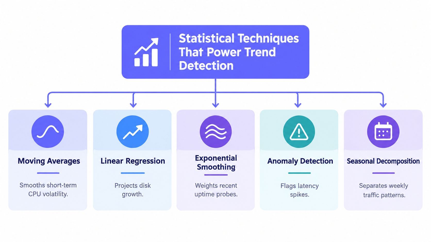
Moving averages reduce short-term volatility
A moving average replaces a noisy sequence with a smoother view. For CPU utilization, it can prevent brief workload bursts from dominating the signal and help reveal whether the host's typical load is gradually rising.
The trade-off is delay. A longer window suppresses more noise but reacts more slowly to a genuine change. A shorter window responds faster but can produce alerts that follow ordinary workload variation. Moving averages work well when the question is, “Has the typical level changed?” They work poorly when the system needs immediate detection of a sharp incident.
Exponential smoothing favors recent evidence
Exponential smoothing gives newer observations more influence than older ones. That makes it useful when a recent deployment, traffic shift, or configuration change may have altered the operating regime.
For an uptime latency metric, recent degradation should usually matter more than observations from a much older regime. The failure mode is overreaction. If the smoothing factor is too responsive, a temporary event can look like a permanent shift. If it's too conservative, the method preserves stale history after the system has genuinely changed.
Decomposition separates the meaningful signal
Decomposition splits a time series into trend, seasonal, and residual components. A disk metric may contain a persistent growth curve, nightly backup effects, and irregular cleanup activity. Separating those components helps an operator estimate the underlying capacity direction instead of extrapolating every spike.
This technique fails when the seasonal pattern isn't stable or when the available history doesn't represent current behavior. A changed backup schedule can make an old seasonal component actively misleading.
ARIMA and SARIMA model dependence over time
ARIMA models account for autocorrelation, meaning that earlier observations can influence later ones. SARIMA extends that approach with seasonal structure. These methods can help forecast metrics where the order and timing of previous values contain useful information, such as recurring demand or service latency patterns.
They require careful model selection and clean, consistently sampled data. They can also be difficult to explain during an incident, especially when a simpler baseline would have supported the same decision. The right method is the least complex one that answers the operational question without hiding uncertainty.
VictoriaMetrics' discussion of time-series databases is relevant to this design choice because storage and query behavior affect how much historical context operators can retain and inspect. More history helps only when the underlying measurements remain comparable.
A Practical Trend Analysis Workflow for DevOps and SRE Teams
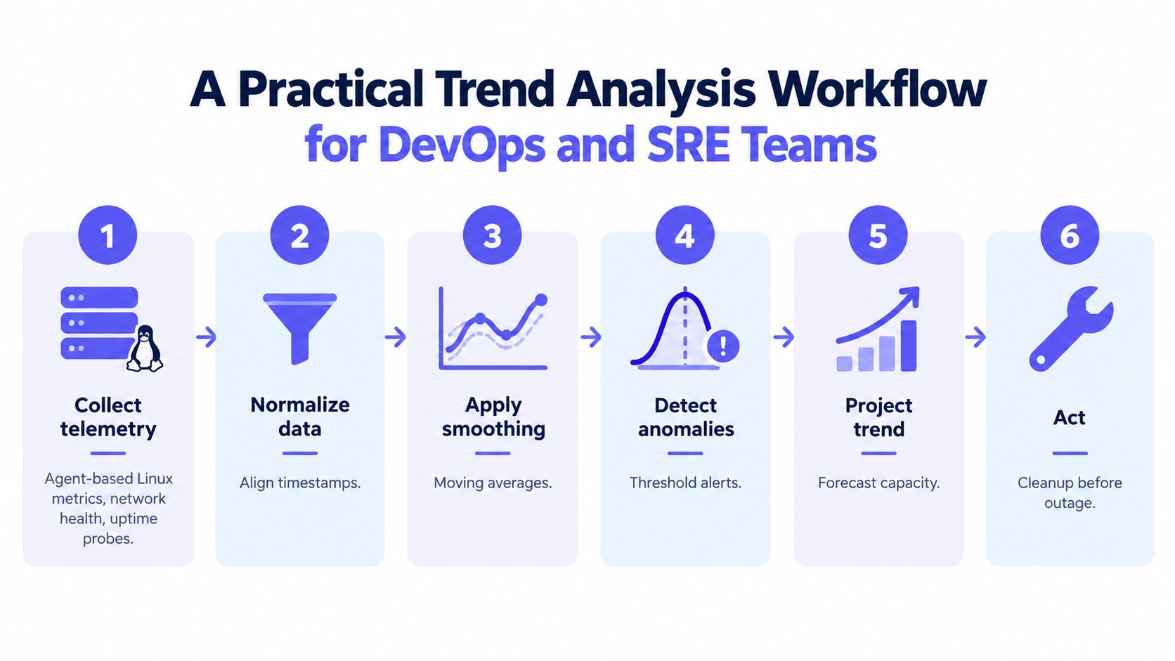
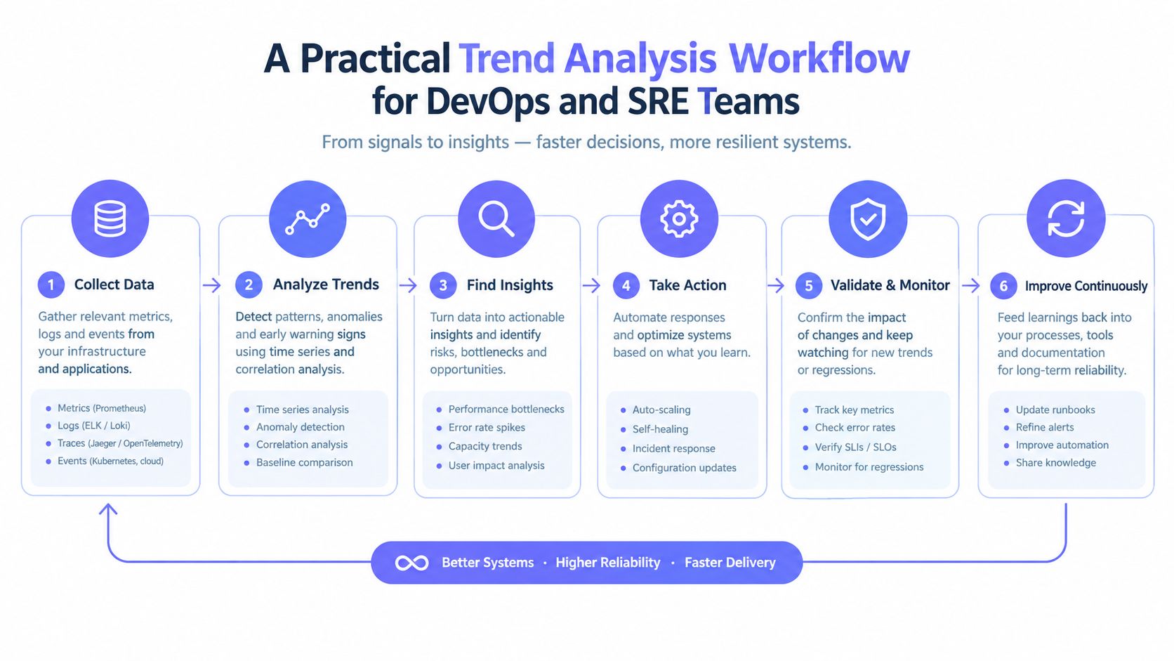
A reliable workflow begins before any statistical method is selected. The team first defines the decision the signal should support. “Monitor disk usage” is incomplete. “Create enough lead time for cleanup or capacity expansion before writes fail” gives the metric an owner and a purpose.
Collect telemetry with operational context
Useful inputs include Linux host metrics, container resource usage, network-device health, website probes, and cron outcomes. Each measurement needs a timestamp, an identity, and enough context to compare like with like. A server's disk trend shouldn't be mixed with another host's lifecycle or interpreted without knowing whether a deployment changed retention behavior.
Normalize the observation window
Sampling intervals must remain consistent. Timestamps need alignment, units must be comparable, and missing observations should be visible rather than treated as normal values. The same discipline applies to regional uptime probes. A change in probe coverage can create an apparent service trend even when the service hasn't changed.
Detrending is useful when repeating calendar effects distort alerting or capacity planning. Operators can remove a known seasonal component, inspect the residual behavior, and then decide whether the remaining direction warrants action.
Establish a baseline and compare against it
The baseline should reflect the relevant time window and workload. A moving average can smooth the raw series, while exponential smoothing can prioritize recent operating conditions. Seasonal decomposition helps keep recurring patterns from masquerading as drift.
The comparison should produce a decision-ready output:
- Level: Is the current value outside the expected range?
- Slope: Is the metric moving in a concerning direction?
- Forecast: When might the metric reach an operational limit?
- Confidence: How stable is the estimate across comparable windows?
Correlate before escalating
A disk trend becomes more credible when it appears alongside growing log volume or a changed retention policy. A latency trend becomes more actionable when it aligns with heightened queue depth, regional concentration, or a recent release. Correlation doesn't prove causation, but it helps the responder choose the right investigation path.
A platform such as Fivenines can place Linux, network, uptime, and cron telemetry in one monitoring environment, allowing operators to inspect related signals without stitching together separate data sources. The value lies in comparable context, not in producing another isolated chart.
Trend Analysis in Action with Real Metrics
Trend analysis earns its place in operations when it changes a decision. Three metric stories show the difference between noticing movement and using it.
A Linux host's disk curve rises steadily while CPU and memory remain ordinary. The forecast indicates that available space will be exhausted in 18 days, so the team schedules cleanup and reviews retention before the next operational crunch. The alert doesn't page the overnight engineer because the response is planned, owned, and tied to a forecast horizon.
A network device tells a subtler story. Traffic rises every Monday morning, then returns to its prior range, which indicates seasonality rather than immediate capacity exhaustion. After the recurring pattern is removed, the underlying weekly direction still climbs. The network team therefore treats the residual slope as a capacity-planning input instead of scaling equipment solely for a familiar peak.
An uptime monitor shows response times worsening gradually across several regions while checks continue to pass. The pass or fail status hides the degradation, but the latency trend gives the team a chance to inspect the application path, provider behavior, and regional dependencies before customers experience a clear availability failure. Multi-region evidence makes the signal more credible than a single probe behaving badly.
The misleading case is equally important. A monitoring-agent update changes collection frequency, creating more observations and an apparent shift in the plotted metric. The system hasn't necessarily changed, but the measurement process has. Without checking sampling continuity, an operator could trigger cleanup, scaling, or escalation based on an artifact.
Custom dashboards and metrics and dashboards guidance help teams inspect the underlying series, but visualization isn't validation. The decision still depends on aligned windows, known changes, and corroborating signals.
Turning Detected Trends Into Alerts and Automation
A detected trend has little operational value if it remains on a dashboard no one owns. The alert must define what movement matters, when it becomes actionable, who receives it, and what happens if the first response fails.
Three alert patterns cover most infrastructure use cases:
- Slope thresholds: Alert when a metric's rate of change remains beyond an agreed direction for a sustained window.
- Time-to-exhaustion forecasts: Alert when projected capacity reaches a limit inside the team's remediation horizon.
- Deviation bands: Alert when a metric moves outside a baseline range after seasonal effects have been accounted for.
Each pattern spends noise budget differently.
| Alert Strategy | What It Detects | Noise Risk | Best Use Case |
|---|---|---|---|
| Slope threshold | Persistent directional movement | Medium, especially during workload changes | Disk growth and traffic capacity |
| Time-to-exhaustion forecast | A projected collision with a hard limit | High if the forecast has little history | Storage, quotas, and certificate-like expirations |
| Deviation from baseline | Behavior outside expected variation | Medium to high around seasonal events | Latency, load, and service health |
| Multi-region confirmation | Shared service degradation | Lower for regional faults, slower for isolated failures | Uptime and external availability |
Routing should use channels the team already monitors, including Slack, Microsoft Teams, Telegram, Discord, email, SMS, Pushover, and webhooks. A trend alert can start as a low-urgency notification, gain urgency after repeated confirmation, and escalate when the projected response window narrows.
Design principle: Delayed escalation is safer than immediate paging only when the delay has a defined owner and a clear exit condition.
Workflow automation should support routing, delays, retries, and escalation. Uptime trends deserve failure confirmation from multiple regions before paging, because one probe can reflect a local path problem rather than a service-wide failure.
Infrastructure-as-code closes the governance gap. A public REST API and Terraform provider let teams version monitor definitions, thresholds, destinations, and baseline rules alongside infrastructure changes. Fivenines offers these management patterns together with telemetry for servers, networks, uptime, and scheduled jobs, making it one possible implementation choice rather than a substitute for alert design.
Common Pitfalls and How to Validate a Real Trend
A rising line can trigger an alert while the system remains healthy. The cause may be a collector change, an incompatible comparison window, a one-time workload event, or a seasonal pattern that repeats without worsening. Acting on that signal can create noisy pages and unnecessary remediation.
Start with time alignment. A comparison is weak if the windows use different cutoffs, workload phases, regional samples, or reporting periods. The Google Trends dataset spanning January 1, 2025 through April 7, 2026 shows how near-real-time feeds can support trend work, but feed availability does not prove persistence or comparability. Independent reporting on the 2026 Digital Overview's comparison limitations also describes how mismatched cutoff dates can distort year-on-year comparisons.
Validate the signal before converting it into an alert or capacity change:
- Repeat the window: Look for the same direction across comparable windows, not one prominent run.
- Separate repetition from acceleration: A recurring seasonal peak is different from a peak that grows each cycle.
- Audit measurement continuity: Check collection intervals, gaps, agent versions, probe locations, and label changes.
- Compare regions carefully: Confirm that coverage and network paths remained consistent before treating measurements as equivalent.
- Re-baseline after change: Mark deployments, migrations, retention changes, and hardware replacements before fitting a new forecast.
Before paging: Ask whether the system changed, the workload changed, or the measurement changed.
Keep infrastructure changes visible in the analysis. A storage migration can invalidate a disk baseline, while a caching layer can alter latency distribution. A collector update can create denser data without changing system behavior. Trend analysis becomes actionable only when operators verify the measurement process, confirm the trend across relevant dimensions, and define what evidence justifies alerting or remediation.
Getting Started and Measuring What Matters
Start with a small set of business-critical signals, such as disk capacity, service latency, or network utilization. Assign each metric an owner, baseline, forecast horizon, and response path. Build the baseline across a representative seasonal cycle, rather than treating a short, unusual window as normal.
Use an operating checklist:
- Select consequential metrics: Begin where a slow failure could affect customers or operations.
- Define action thresholds: Specify the slope, deviation, or forecast that triggers notification or escalation.
- Connect the workflow: Route alerts through existing channels, with retries and clear ownership.
- Review false positives: Inspect noisy alerts regularly, then adjust the model or input data.
- Record system changes: Re-baseline after deployments, migrations, and collector updates.
- Measure response, not dashboard volume: Track whether detection leads to timely remediation.
Faster analytics does not shorten response time by itself. Interpretation, cross-team handoffs, ownership, and routing often determine whether a detected trend produces action. Set an explicit path from signal validation to alert, capacity change, or remediation, and record why the team accepted or rejected each recommendation.
As history accumulates, trend analysis can support capacity planning, maintenance scheduling, and controlled remediation instead of reactive thresholding. The objective is a dependable path from a credible signal to an owned decision before the system forces one.
Fivenines brings Linux server metrics, network-device health, uptime checks, and cron monitoring into one operational view, with historical charts, multi-region failure confirmation, workflow routing, and infrastructure-as-code support. Teams can use these capabilities to turn gradual infrastructure movement into owned alerts and planned remediation, so visit Fivenines to evaluate the monitoring workflow for the environment.