Identifying Bottlenecks in Infrastructure and Applications

You can stare at a green dashboard all morning and still miss the actual problem. The graphs look calm, the pager stays quiet for a while, and then the same service starts breaching its SLO again because work is stacking up somewhere the standard charts don't make obvious. Identifying bottlenecks starts with admitting that a healthy-looking dashboard can still hide a slow queue, a blocked worker, or a handoff that nobody is measuring.
Table of Contents
- Why Bottlenecks Hide Behind Healthy Dashboards
- Map Dependencies and Define a Reproducible Baseline
- Collect the Right Metrics with the USE Method
- Trace Blocked Time and Correlate Signals Across Layers
- Validate the Root Cause with Controlled Experiments
- Fold Findings into Monitoring, Alerts, and Runbooks
- When the Bottleneck Is Not in Your Servers
Why Bottlenecks Hide Behind Healthy Dashboards
A service can appear stable on the surface while users still feel lag, timeouts, or inconsistent completion. That happens because dashboards often show utilization, but not the saturation or errors that reveal whether a resource is limiting flow. The useful mental shift is to treat identifying bottlenecks as a measurement problem first and a tuning problem second, because premature optimization usually chases the wrong layer.
Start with the symptom, not the machine
The fastest way to get lost is to open with CPU graphs and decide they must be the cause. A better first move is to define the user-visible symptom, the workload that reproduces it, and the exact time window when the failure happens. ACM's performance-analysis guidance separates continuous monitoring from root-cause analysis and recommends the USE method early because it narrows systemic bottlenecks quickly, which is the right order when a service looks fine but doesn't behave fine under load.
Practical rule: if the symptom window does not overlap an abnormal saturation signal or an error signal, the suspected resource is probably a distraction.
That's also why averages are dangerous. A mean CPU chart can look tame while tail latency is exploding because a queue formed briefly and cleared before the next sample flattened it out. The same problem shows up in latency monitoring, where the mean hides the requests that are doing the damage.
For a useful starting point, the framework for diagnosing bottlenecks is a good adjacent read because it reinforces the same habit, separate the symptom from the constraint before trying to fix anything. In production, that discipline saves a lot of time that would otherwise be spent upgrading the wrong layer.
Trust queues, tail latency, and overlap
The first pass should inventory every relevant resource, CPU, memory subsystem, disk, network interface, database pool, queue, and external dependency. For each one, record utilization as a time-based percentage, saturation as queue depth or waiting time, and errors as a count or rate. Then compare those signals to the symptom's timeline, not to a vague sense that “the system was busy.”
That is the difference between a resource that looks busy and a resource that is the bottleneck. High utilization alone does not prove causation. The next sections use that distinction to keep the investigation from spiraling into guesswork.
Map Dependencies and Define a Reproducible Baseline
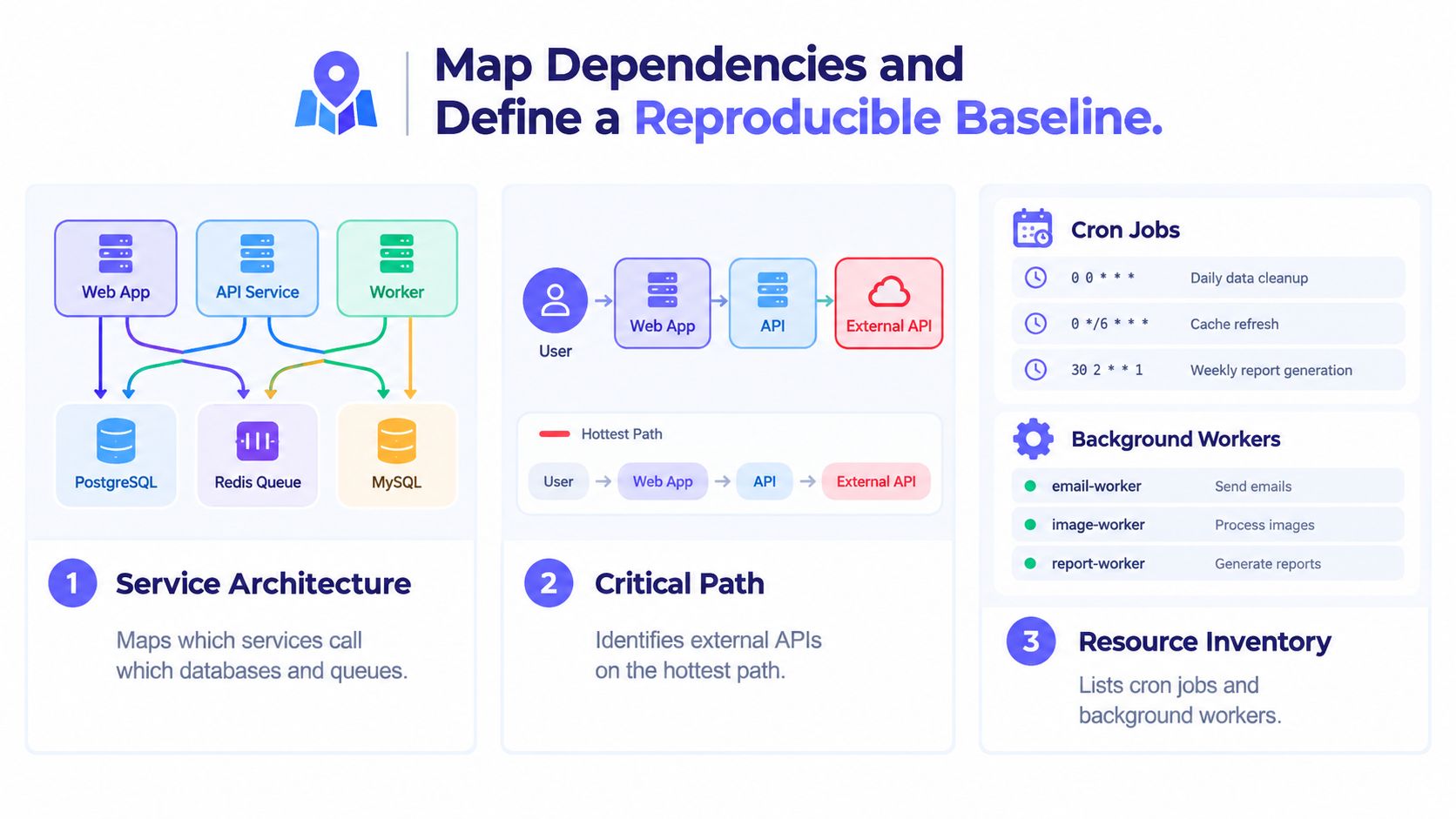
Before any metric collection, the dependency graph has to be explicit. A request path that crosses a reverse proxy, an app tier, a database pool, a queue, and one external API behaves very differently from one that stays inside a single process, and treating them the same wastes hours. A solid baseline document names each service, each shared resource, each cron job, and each background worker that can touch the same CPU, disk, or network budget.
Build the map from the system that exists
Container labels, traces, and network flow logs usually tell the story faster than architecture diagrams that are months out of date. On Linux, lsof, ss, and ps help confirm what is open and active, while container and orchestration metadata tell you which process belongs to which unit of work. In Proxmox, Docker, and Kubernetes, the practical question is the same, which tenant or workload can contend for the same host resource at the same time.
The goal is not just inventory, it's shared context. A baseline that records the critical path and the background jobs avoids the classic argument where one team blames the app tier, another blames the database, and neither can prove which flow was active during the failure window. That baseline should also note what was intentionally excluded so nobody changes the test without notice by adding a new job or moving traffic mid-investigation.
A reproducible baseline is only useful if the same workload can be rerun without improvisation.
The performance baseline guide is a useful internal reference for turning that map into a document colleagues can reuse. The point is to create a stable comparison point, not a perfect model of reality. A written baseline keeps the next investigation from starting at zero.
Freeze the workload before measuring
A reproducible workload needs a fixed input shape, a warm-up period, synchronized timestamps, and before/after measurements. Without those, one run cannot be compared fairly to the next. If the system is being tested under changed concurrency, changed payloads, or changed routing, the result may still be interesting, but it is no longer evidence.
That baseline should also say what not to touch. If one diagnostic run changes the app config, the database pool, and the cache layer together, no one can tell which change mattered. Identifying bottlenecks works best when the environment is boring and the workload is repeatable.
Collect the Right Metrics with the USE Method
The USE method works because it forces a separate answer for every relevant resource, not a blended impression. Utilization tells you how busy the resource is, saturation tells you whether work is waiting, and errors tell you whether requests are failing or being dropped. When those three signals are tracked together, a resource can be judged on evidence instead of intuition.
Measure each resource on its own terms
CPU is the obvious case, but the same logic applies to memory, disks, network interfaces, database pools, queues, and external dependencies. A disk can show modest utilization and still be the bottleneck if waits are piling up. A database pool can look healthy while connection acquisition starts queueing behind it.
That's why percentiles and maximums matter more than means when the service feels slow. Averages flatten out the spikes that cause users to notice problems, and queueing effects often appear in those spikes first. For triage, capture the highest-value signals first, then keep retention long enough to compare the next run to the last one.
| Resource | Utilization signal | Saturation signal | Error signal |
|---|---|---|---|
| CPU | Busy time percentage | Run queue or runnable wait | Throttling or failures |
| Memory subsystem | Active use trend | Waits caused by pressure | Allocation failures |
| Disk | Busy time percentage | I/O queue depth or wait time | I/O errors |
| Network interface | Link activity percentage | Buffer backlog | Drops or retransmits |
| Database pool | Checked-out connection time | Wait time for a free slot | Checkout failures |
| Queue | Consumer activity percentage | Queue depth or age | Rejected or failed jobs |
| External dependency | Request activity percentage | Upstream wait time | Upstream errors |
That table is useful because it keeps the definitions aligned. A resource can be near capacity without being the bottleneck, and a resource can have modest utilization while still backing up badly. The only reliable answer comes from reading the three signals together in the same time window.
Pick the combination that narrows the search
If utilization is high, saturation is low, and errors are absent, the resource is busy but probably not the constraint. If utilization is low and saturation is high, the system is waiting on something that is not reflected by raw busy time, which usually means contention, queueing, or an upstream dependency. The practical test is simple, follow the symptom into the resource that shows both waiting and overlap, not the one that merely looks active.
For CPU-focused triage, the internal CPU usage monitoring guide is a helpful companion because it reinforces the difference between load, queueing, and simple activity. In production, that distinction keeps teams from mistaking work being present for work being blocked. The right metric set usually shortens the investigation faster than any manual guess.
Trace Blocked Time and Correlate Signals Across Layers
Once the coarse metrics point to a likely area, the next job is to attribute elapsed time. Blocked-time analysis asks where time went across workers, stages, and dependencies, instead of assuming the slowest-looking component caused the delay. That matters in distributed jobs, because the visible queue is often not the actual limiter.
Separate service time from waiting time
On-CPU and off-CPU sampling make that split visible. On-CPU sampling shows where code is executing, while off-CPU sampling reveals lock contention, condition-variable waits, and I/O waits that a normal execution-time profiler can miss. Recent systems work combines those views for a reason, because a thread that is not running can still be the most expensive part of the timeline.
Blocked-time analysis is especially useful in Spark-style workloads and other distributed jobs where one stage looks crowded but another stage is the actual limit on throughput. The method is to instrument task start and end times, capture wait intervals, aggregate by stage and worker, then rank the categories by blocked-time contribution. That sequence keeps the investigation honest.
Practical rule: don't optimize the queue that is easiest to see, optimize the one that owns the most blocked time.
The relevant internal reference on event correlation fits naturally here because correlation only helps when timestamps and request IDs line up. Shared IDs, synchronized clocks, and aligned trace windows let logs and metrics tell the same story. Without that alignment, the trace is just a second source of noise.
Use the timeline, not the symptom label
A request that times out can be delayed by CPU service time, scheduler delay, network, storage, synchronization, or an external dependency. The fix depends on which category owns the wait. That's why a slow span should be inspected against the system timeline, not only against a list of “bad” services.
A practical workflow is to start with the spans that exceed the p99 budget, then check whether they overlap an abnormal saturation window in the underlying host or dependency. If they do, the blocked-time signal is probably real. If they don't, the problem may be measurement drift, traffic skew, or a coordinating system that's hiding the true wait.
Validate the Root Cause with Controlled Experiments
A bottleneck isn't confirmed until a controlled change improves the right outcomes together. That means throughput should improve, tail latency should improve, and error rate should improve after one isolated intervention. If only one of those moves, the fix probably shifted the constraint instead of removing it.
Change one variable and rerun the same workload
The cleanest experiment changes one thing at a time while holding the workload, timestamps, warm-up period, and observation window constant. That can be a synthetic load test, a replay, a canary, or a small chaos probe that degrades a dependency without taking the whole system down. The important part is that the new run is comparable to the old one.
| Experiment Design Quick Reference | What to Hold Constant | What to Measure |
|---|---|---|
| CPU tuning | Workload shape, warm-up, routing | Throughput, tail latency, error rate |
| Storage change | Request mix, concurrency, test window | Wait time, blocked time, failures |
| Queue adjustment | Producer rate, consumer count, timestamps | Queue depth, completion time, drops |
| Dependency mitigation | Same payloads, same duration | Recovery time, tail latency, errors |
That structure keeps the result readable in a post-incident review. If the hypothesis was wrong, the experiment still matters, because it tells the team which layer is not causal. If two changes happen together, the result is much harder to trust.
Use experiment design instead of intuition
The design of experiment guide is a useful complement because it formalizes the same discipline, isolate variables, observe outcomes, then keep only what helps. That framing is especially useful when two bottlenecks compete for the same resource. A memory fix can expose a disk issue, or a queue change can reveal a downstream dependency problem.
If the same workload doesn't get rerun, the “fix” is just a story.
The best outcome is not a dramatic improvement story, it's a defensible one. That's what lets the next team trust the conclusion instead of reopening the same debate later.
Fold Findings into Monitoring, Alerts, and Runbooks
A bottleneck investigation pays off only if the next incident starts with what was learned, not with rediscovery. That means dashboards need the right signal, alerts need confirmation logic, and runbooks need the exact diagnostic path that worked. Without that handoff, the organization pays for the same investigation twice.
Turn the discovered bottleneck into an operational pattern
If the actual limit was queue age, the queue age chart should be prominent. If the delay lived in a dependency handoff, the alert should include enough context to show where confirmation slowed down. Uptime probes also benefit from multi-region confirmation, because intermittent failures can create false pages when a single source sees a transient problem.
The same idea applies to routing. Alerts work better when they carry the surrounding context, recent deploys, the suspected service owner, and the escalation path, so responders don't waste time rebuilding the story. Tools that expose per-container, Proxmox, and NVIDIA GPU metrics alongside host telemetry can make that view consistent across bare metal, VMs, and containers, which reduces the “different stack, different dashboard” problem.
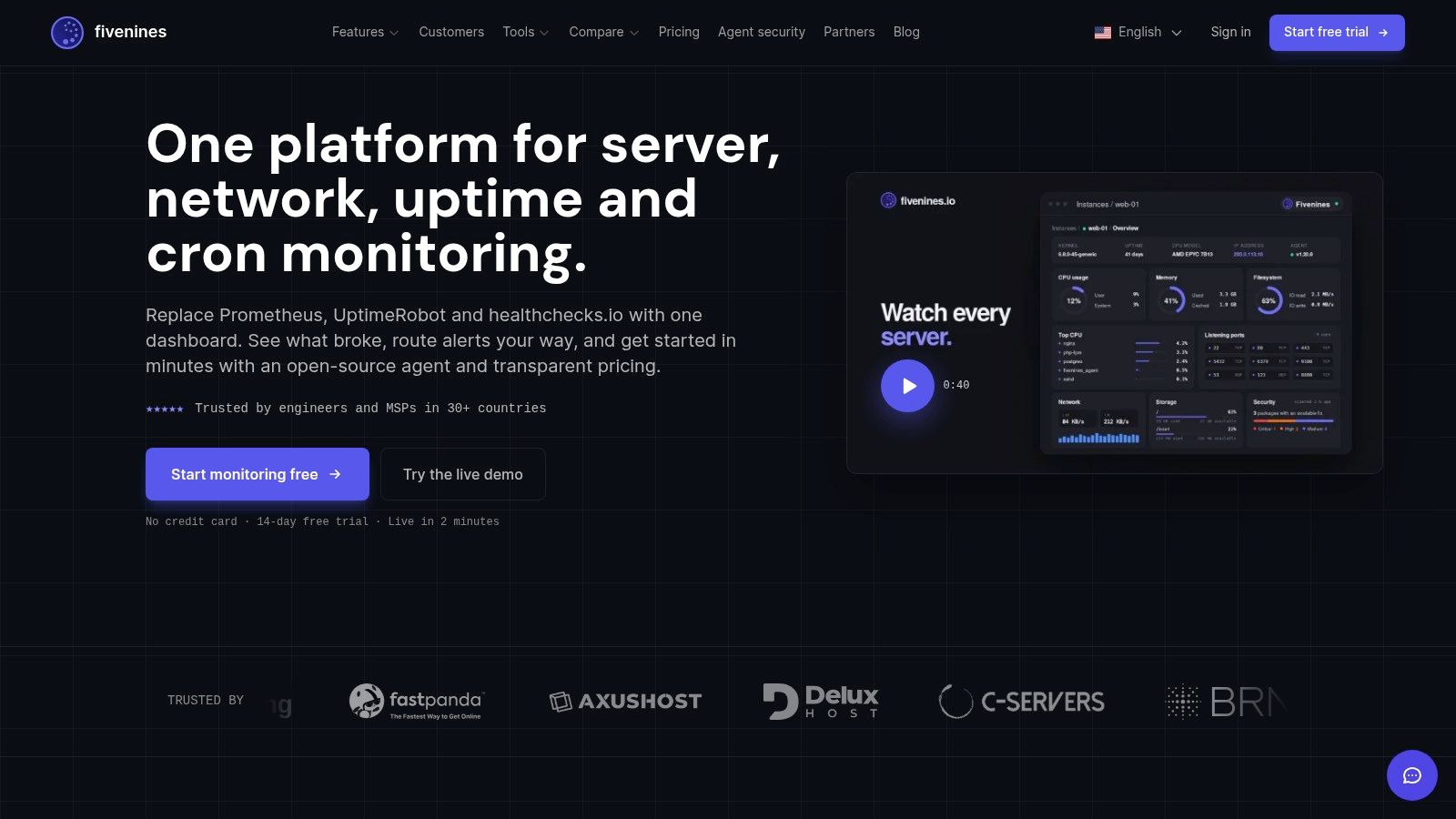
The screenshot below is a useful reminder that operational visibility has to be legible, not just complete.
Make the runbook match the real path
A good runbook names the checks in the order they resolved the incident, not the order somebody would like them to have had. If the fix involved checking a service queue, then a host metric, then an external dependency, the runbook should mirror that path. That saves the next responder from inventing a new workflow in the middle of an outage.
For teams that want automation wrapped around that flow, the incident management automation guide aligns well with this step because the goal is the same, reduce handoff friction after an alert fires. The automation support services resource is relevant too when the workflow needs durable routing, retries, and maintenance rather than another manual checklist. Fivenines itself is one option in this space, because it unifies server metrics, uptime checks, cron job tracking, and workflow automation in one monitoring view.
When the Bottleneck Is Not in Your Servers
A dashboard can look like infrastructure is the problem while the true bottleneck sits in code review, testing, deployment, or incident coordination. AI-assisted development makes that misread easier, because output can rise while constraints shift downstream. One 2025 analysis reported a 1.5% decline in delivery throughput and a 7.2% decline in delivery stability for every 25% increase in AI adoption as reported in TechTarget's DORA coverage. Fast code does not mean fast delivery.
Triangulate the value stream, not just the host
CPU, latency, and queue depth matter, but they are only part of the delivery system. A release can stall because review queues are backed up, a test environment is slow, or ownership confirmation takes too long after a check fails. Host telemetry needs to sit beside queue age, review turnaround, failed-deployment recovery, rework, and incident data before anyone blames the servers.
That becomes more important when the delivery system is absorbing AI-generated output. DORA's 2025 AI adoption findings note that 90% of technology professionals use AI at work and more than 80% perceive productivity gains, while 30% have little or no trust in generated code. That kind of output creates validation work that will not show up cleanly on an infrastructure dashboard, but it does show up in the queue between coding and release.
Ask the right bottleneck question
After an incident, the useful question is not “which server was slow?” It is “which stage was waiting, and what evidence proves it?” That framing catches the measurement bottleneck, the technical bottleneck, and the coordination bottleneck before the team wastes another cycle tuning the wrong layer. Identifying bottlenecks stays useful only when it points to the waiting work, not just the loudest metric.
If a team needs to turn those signals into a durable monitoring and incident workflow, Fivenines brings server metrics, uptime checks, cron tracking, and alert routing into one place. It fits when the goal is to catch the true bottleneck faster, keep the evidence attached to the alert, and make the next investigation shorter than the last. Visit Fivenines to see how that workflow can be applied in production.